

Why Opt for Color Consultation in Cypress, TX?
Selecting paint colors in Cypress, TX, can be challenging and colors appear differently under varying lighting conditions.
Trendy hues may appear excessively cool or warm, and large open areas complicate matters further, therefore, residents of Bridgeland, Towne Lake, and Coles Crossing rely on Cypress Supreme Painting & Contracting for assistance.
We provide you with a professional color scheme that will look stunning in your home's lighting, thus giving you the desired appearance.
An Example from Fairfield Village
A husband and wife desired a contemporary appearance without being overly cool, and following consultation using large samples and on-wall testing, they chose a beautiful greige.
It brightened the area and complimented their warm floors, so friends took notice and scheduled a consultation the following week.
Issues Resolved
Fearful of choosing the wrong color that will change at night
Trendy colors become purple or green in your lighting
Open concept areas appear mismatched from one room to another
Keeping existing counters, floors, and cabinets but looking for an update
Our Color Consultation Process
A successful color consultation starts with listening. When Cypress Supreme Painting & Contracting visits your home, the consultant first walks through your spaces, noting how natural light changes throughout the day, what type of bulbs are in your fixtures, and which surfaces—floors, countertops, cabinets, and furniture—must coordinate with the new paint colors.
Homes in Cypress often feature open entryways, tall ceilings, and large windows, so it is crucial to consider how a color will read from the foyer to the living room, kitchen, and hallways.
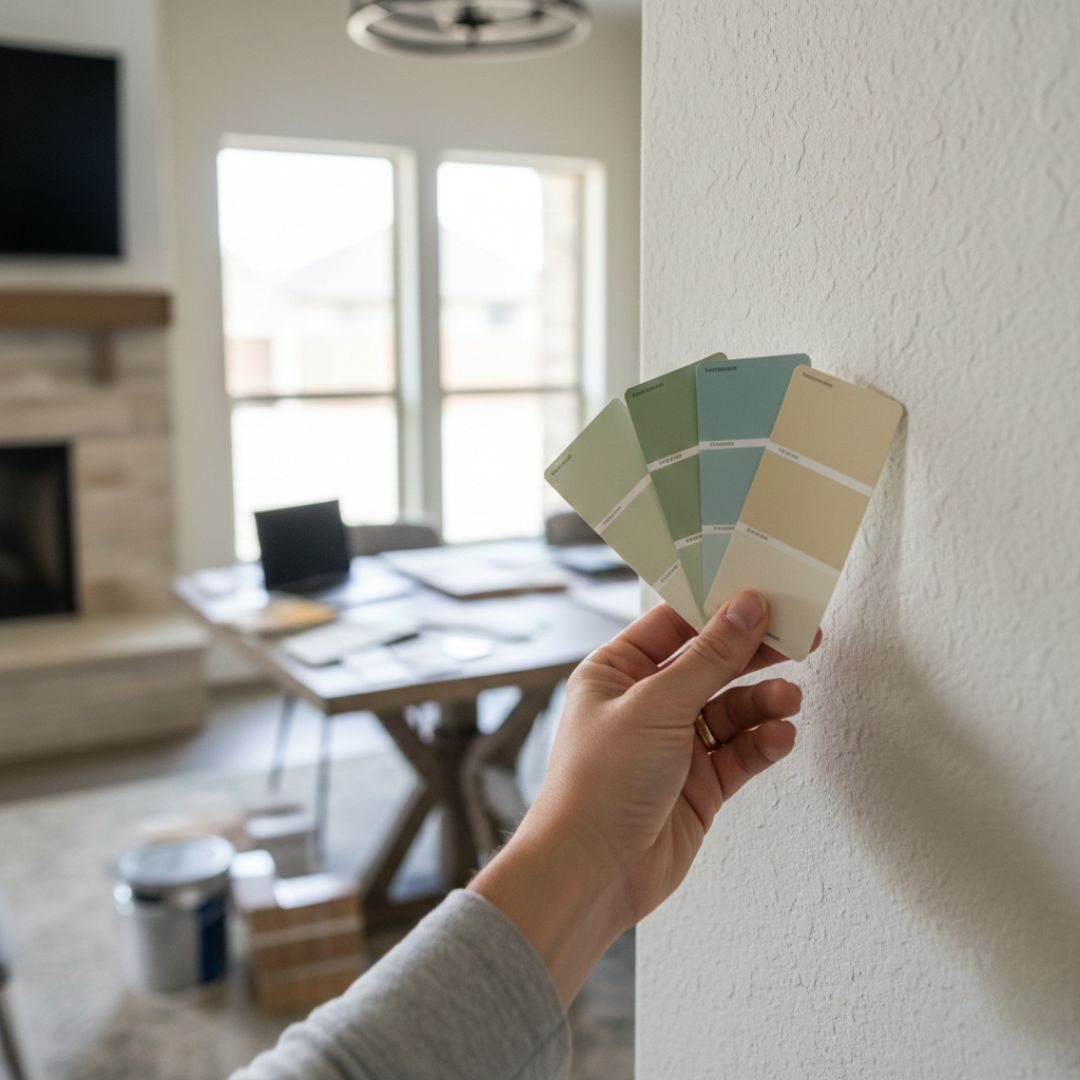
From there, we review your style preferences: warm or cool, bold or subtle, modern or traditional. Large swatches and fan decks are used to narrow down options for walls, trim, ceilings, and potential accent walls. Because our team also performs the painting work, we understand how specific products and sheens will perform in different rooms—from low‑sheen finishes in bedrooms to more washable options in high‑traffic hallways and kids’ spaces.
For homeowners planning a complete interior refresh, our interior residential painting overview explains how color choices tie into wall, ceiling, and trim painting for a cohesive result.
Cypress homeowners often ask whether to stick with neutrals or embrace deeper tones. The answer depends on your light, room size, and how you use each space.
For example, a cozy media room near Highway 290 may benefit from richer hues, while a north‑facing home office in Towne Lake might need a slightly warmer neutral to balance cooler light. Our consultants also review how color can affect perceived mood and energy.
For more background on how color influences people psychologically, some homeowners find it helpful to reference independent resources such as the color psychology overview from Verywell Mind, then rely on our local expertise to translate those ideas into real‑world paint choices that work in Cypress homes.
To complete the process, you leave the consultation with a clear plan: selected colors for each space, recommended sheens, and how those choices align with your project timeline and budget.
What You Can Expect
Tailored palette development based on your lighting, finishes, and aesthetic preferences
Large-scale sample testing and on-wall applications for realistic decision-making
Trim, wall, and ceiling coordination utilizing whites with mindful undertones
Practical, long-lasting recommendations including low-VOC and durable finishes
Concise next steps and a paint-ready specification sheet for seamless implementation
Request Service
Ready to Refresh Your Home?
Schedule your professional color consultation today, and contact us or request an appointment. We proudly serve Cypress, Katy, Tomball, Spring, and Houston.
Fall in love with your colors before the first gallon is even opened, thus you will be satisfied with the result.
STILL NOT SURE?
FAQs about Ceiling Painting
What will the color appear like in the evening?
We compare options under your existing lighting conditions, and can recommend adjusting the bulb color if necessary, because this ensures the best result.
How do you address open concept areas?
We create a primary neutral plus accent strategy for cohesion, along with room-specific hues for playfulness where appropriate, thus providing a comprehensive solution.
Can we retain our existing countertops and flooring?
Absolutely, and we identify undertones in stone, tile, and hardwood, then develop a palette that complements them.
Do you recommend specific brands or finishes?
We recommend long-lasting, low-VOC products, and appropriate finishes for each application: matte or eggshell for most walls, satin or semi-gloss for trim and doors, and flat for most ceilings, because this ensures durability and aesthetics.


CONTACT US
Call Today: (832) 979-1485
Email: [email protected]
OFFICE HOURS
Mon-Fri: 8am to 5pm
Sat: 12pm to 5pm
Sun: Closed

Why does the color look wrong once it is on the wall?
Because you chose it somewhere other than the room it went in. Four things change how a color reads:
- Light direction. A north facing room gets cool, even light all day. A south or west facing room in Houston gets strong, warm light that pushes colors lighter and yellower.
- Time of day. The same wall is a different color at 9am and 5pm. Judge a sample at both.
- Sheen. Flat, eggshell and satin of the identical color look like three different colors, because sheen changes how much light bounces back.
- Everything else in the room. Floors, cabinets, countertops and even a lawn outside the window all throw color onto the wall.
This is why a chip under store lighting is close to worthless. Colors have to be judged large, in place, at more than one hour of the day.
Houston Light Is Not Neutral Light
Local sun matters more here than most people expect. The National Weather Service records a July normal high of 94.5 degrees at Houston Intercontinental, and the light that comes with that heat is strong and warm.
In practice, a south or west facing Cypress room takes hours of intense, warm afternoon light. Warm whites can go creamy or even yellow. Greiges drift warm. Colors that looked sophisticated in a showroom can look muddy by four in the afternoon.
North facing rooms do the opposite. The light is cooler and steadier, so warm colors calm down and cool grays can turn flat or slightly blue. The same paint, two rooms in one house, two different results.
Newer Cypress homes add another factor: large windows and open plans mean one color often has to work across several light conditions at once.
Test Big, and Test In Place
Two inch chips lie. Paint a large sample, at least two feet square, directly on the wall you care about, and put a second one on the opposite wall so you can see it in different light. Look at it in the morning, in the afternoon, and at night with the lights on. Only then decide.
What a Color Consultation Actually Does
It is not somebody handing you a fan deck. It is narrowing hundreds of options down to a few that will work in your specific rooms, with your specific light and finishes.
- Look at the whole house, not one wall. Colors have to flow room to room, especially in an open plan where you see three spaces at once.
- Start from what is staying. Flooring, cabinets, countertops, tile and fixed finishes are the constraints. Paint is the cheapest thing in the room to change, so it adapts to them, not the other way round.
- Check the light in each room. Which way it faces, how big the windows are, what is outside them, and what the artificial lighting is.
- Get sheen right. Flat hides imperfections but marks easily. Satin and semi-gloss clean up better and belong in kitchens, bathrooms, and on trim. This decision changes the look as much as the color.
- Test properly. Large samples, in place, viewed at different times.
The Mistakes We See Most
Choosing under the wrong light
A color picked in a store, in a garage, or from a phone screen is a guess. Nothing about that lighting matches the room it is going in.
Trying to make one color do everything
A single color through a whole house sounds simple and often lands flat. It also reads differently in each room anyway, which defeats the point.
Forgetting the ceiling and trim
Wall color gets all the attention, but the whites around it set the tone. A cool white ceiling over a warm wall can make the wall look dirty. Our ceiling painting and trim painting pages cover those surfaces.
Ignoring resale
If you are selling in the next couple of years, the color that pleases you and the color that photographs well and appeals broadly may not be the same one. Worth saying out loud before the decision, not after.
Where a Consultation Pays for Itself
Repainting a room because the color was wrong costs far more than getting it right the first time. It is most valuable when you are doing a whole house, when you have an open plan where several spaces have to agree, when you are working around finishes you cannot change, or when you are preparing to sell.
It pairs naturally with an accent wall, which is the one place a bolder choice carries low risk. And it is the natural first step before any full interior painting project.
Color Consultation FAQ
Do I need a color consultation if I already know what I want?
Probably not for a single room in a color you have lived with before. It earns its keep on whole-house projects, open plans, and anywhere the color has to work with finishes you are keeping.
Why does the same color look different in two rooms?
Light direction and what is in the room. A north facing room gets cool even light; a south or west facing Houston room gets strong warm light for hours. Add reflections from floors, cabinets and whatever is outside the window, and the same paint genuinely is a different color in each space.
How large should a test sample be?
At least two feet square, painted on the actual wall, with a second sample on a wall facing the other direction. Small chips are misleading because color reads differently at scale and against surrounding surfaces.
What sheen should I use where?
Flat or matte for ceilings and low-traffic walls, because it hides imperfections. Eggshell for most living areas. Satin or semi-gloss for kitchens, bathrooms, trim and doors, where the surface needs to be wiped down. Higher sheen also shows more of whatever is underneath, so prep matters more.
Can you match a color I already have?
Usually. A clean chip from an inconspicuous area gives the best match. Bear in mind existing paint has aged and faded, so a perfect match to the original formula may not match what is on your wall today.
Should I pick a color for me or for resale?
Depends on your timeline. Living there another decade, choose what you want. Selling within a couple of years, lean toward broadly appealing neutrals that photograph well. Tell us which and we will steer accordingly.